


A simple framework for crafting your brand identity + 20 examples to kick your creative juices into gear.
What is brand identity?
You’ve heard that a great brand identity is important for your business. In fact, you’ve probably heard it from me. But what does great branding look like and how do you know if you’ve nailed it? If you’re not a designer yourself, figuring this out can sometimes feel out of your league. How are you supposed to know what to do?
I get it. I didn’t start out as a designer either, but I’ve learned along the way.
Here’s the good news, there are a few core elements that make up any great brand design. Knowing what these are and what role they play is your first step. From there, the best thing to do is look around. There are some brands out there that are really rocking it in certain areas. We can look at what they’re doing and learn how to apply their best practices to our businesses.
To help you figure out how to nail your branding, I’ve put together a list of 4 essential elements you need to consider. To top it off, I’m giving you 5 examples of brands that are masters in each of the areas. So, here you have it, a simple framework to great branding and 20 examples to guide you.
1. Colors
Color plays an incredibly important role in your branding. In fact, 85% of consumers cite color as the number one reason they buy a particular product (source). When selecting our brand colors we need to consider the different emotions and characteristics associated with them. Blue, for instance, is often associated with feelings of trust and security while red tends to be associated with power and passion. The colors you choose should give your customers a feel for your personality and the way you want your brand to make them feel.
Color also plays a helpful role in making our brands recognizable and memorable. One study reported that color increased brand recognition by as much as 80% (source). The key is to pick a signature color that really stands out.
Here are 5 brands who have mastered the technique:

Drybar has three primary brand colors: white, grey, and yellow. It’s the yellow that is their signature. In fact, they’ve given it a name: buttercup.
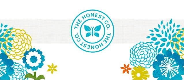
The Honest Company uses a bright color palette that is attractive to its target audience of moms. And, their signature blue creates a sense of trust and reflects their brand name
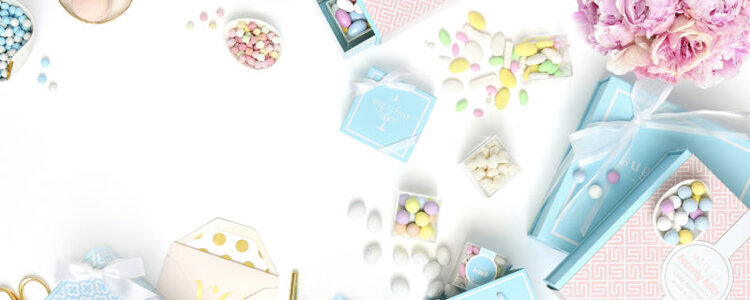
Sugarfina’s blue boxes can’t be mistaken. The color pops and makes the packaging and the brand memorable.
Glossier pink is a thing. The brand has adopted the color which appeals to their female target and also gives the brand a signature on and off the shelf.

Like Drybar, Soulcycle has adopted a relatively simple color palette. Their use of yellow on everything from their bikes, to their logos, to their walls though is what makes the brand stand out.
2. Fonts
Just like color, each font carries a unique personality. Fonts can exhibit a feeling of elegance, tradition, modernity, creativity, and even nostalgia. Many fonts even carry historic or cultural contexts that gives them a deeper level of meaning. Recall classic fonts like Times New Roman, Comic Sans, and Impact and I’m certain each will evoke a different feeling.
Your selection of fonts plays a big role in bringing out your brand’s identity. You want to make choices that reflect your personality however this should not be the only consideration. You also want to ensure your font selections are legible and flexible enough to be used consistently.
Here are 5 brands who are using fonts in the right way:
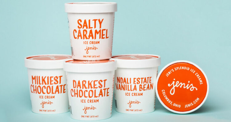
Jeni’s logo looks as if Jeni signed it herself and the font on her pints is reminiscent of a handwritten note. The combination gives you the feeling that the pints are personal and homemade. It’s not by chance, this is exactly their intent.
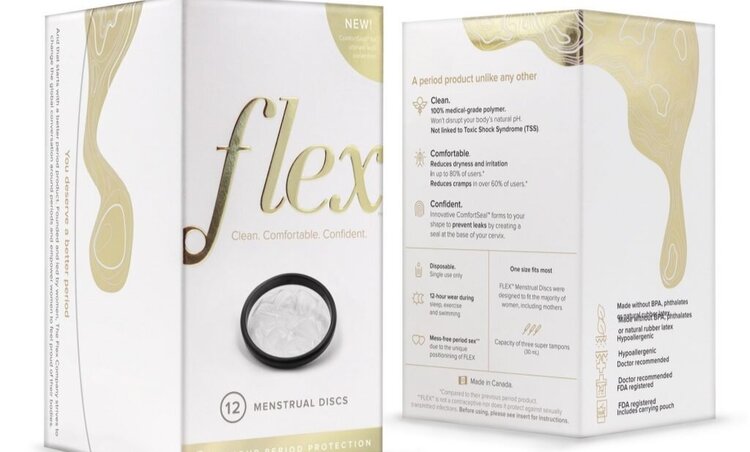
Flex creates period products with the aim is to elevate the experience. Their choice of fonts does just that. The combination of clean lines and script is decidedly sophisticated.
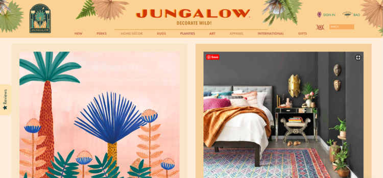
Without knowing anything else about the company, you get a great sense of what The Jungalow is about just by looking at their logo. The organic textures and slightly messy font let you know that the brand is free-spirited.
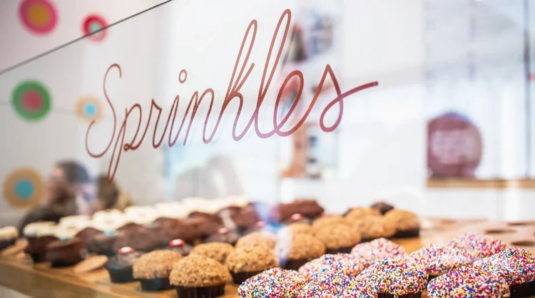
Sprinkles script and sans serif font is a perfect pairing. The script gives charm and delight to the logo while the sans serif creates balance and can be used everywhere from their website to their cupcakes.
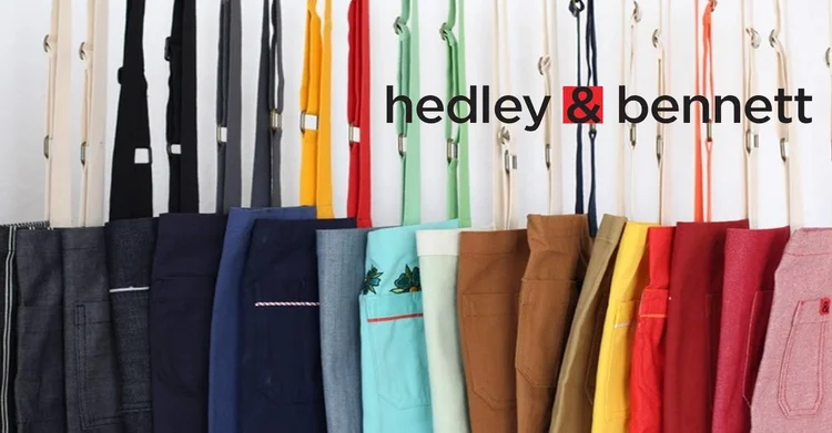
Hedley & Bennett nails it with the emphasis on their & in their typographic logo. It turns the symbol into an icon that the brand is able to use to subtly brand their products.
3. Visuals
Your brand visuals are the images that you use in all of your brand materials including your website, social media, and advertising. They are a powerful tool for bringing to life your brand identity. For that reason, your visual style should reflect the same personality evoked through your choice of colors and fonts.
Beautiful visuals can also play a critical role in capturing and keeping the attention of your customers. You want to develop a unique style that connects with them and tells them something about your brand.
Take a look at how these 5 brands use visuals to show rather than just tell their customers what they’re about:

Outdoor Voices wants you to get outside and do something with someone. For them, it’s not about performance or competition but rather recreation. This idea is embodied in their visuals which show a diverse group of people, in action, doing the things they love together.
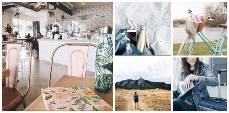
S’well has a mission to rid the world of plastic water bottles. They want you to bring your S’well bottle with you wherever you go. Their visuals support the idea by showing off S’well bottles in all sorts of scenarios.
Laurel & Wolf wants to make the luxury of an interior designer available to everyone. Though they’ve democratized the service, they still want to maintain the high-end appeal. Their visuals help them do just that.
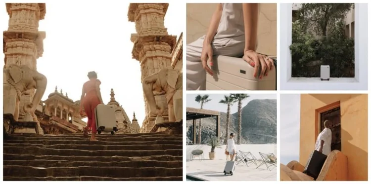
Away wants you to get out and explore. Their visuals don’t just depict their product. They inspire you to take them with you on a great adventure.
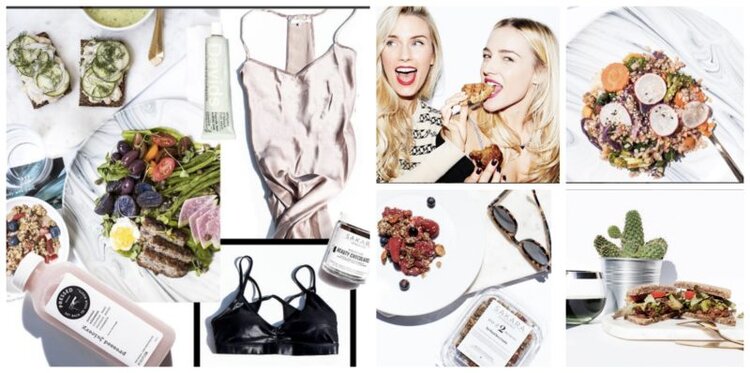
Sakara wants to help you feel lighter and brighter. That same idea comes through loud and clear when you look at their bright, white, visual style.
4. Voice
How you communicate with your customers is just as important as what you communicate. The right selection of colors, fonts, and visuals will fall short if not pulled together with the right message.
Your choice of words not only help bring out your brand’s personality but also establish the type of relationship you have with your customers. It can even help to build a sense of community between them.
Take a look at how these 5 brands have unified their design through an identifiable brand voice:
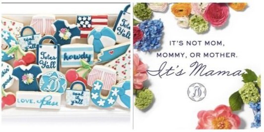
Reese Witherspoon’s brand Draper James is all about honoring her Southern Heritage. The language she uses purposefully has a distinctive Southern charm that really draws out the brand’s personality.

GirlBoss, the movement created by NastyGal founder Sophia Amoruso is all about empowering women. The language they use drives that forward with a strong feminist tone.
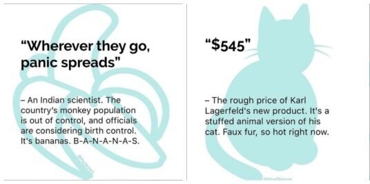
The Skimm wants to make it easier for you to live smarter. That’s why they deliver the facts to their audience in a language they actually understand and care about – including in a lot of pop-culture references.
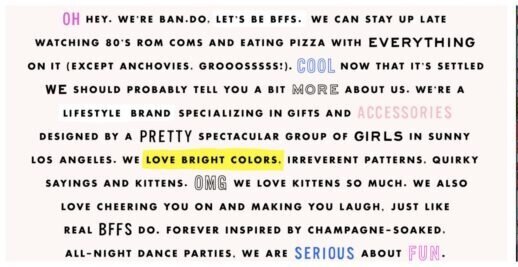
Ban.dō is a lifestyle brand that is serious about fun. It’s not hard to believe them when you see the catchy phrases they use across their products and the relatable tone they use on their website.
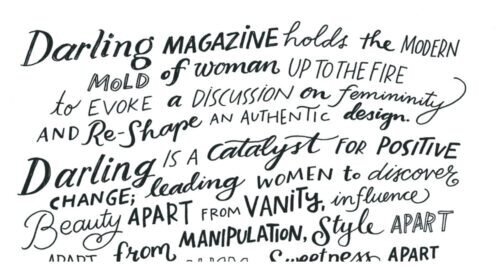
Darling is a media platform that wants to share the art of being a woman. Their modern manifesto makes that clear. As does the way they title the women they profile with names like The Confidant, The Dreamer, and The Explorer.
Brand Identiy Wrap Up
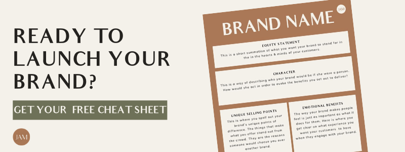
You don’t have to be a designer to know how to think like one. When you’re planning the branding for your business start with your colors, fonts, visuals, and language. Consider how the four will play off one another and how together they can best bring to life your brand personality. Not sure what that is? Start with this free guide and you’ll be ready to rock ‘n roll.
Which brand’s design do you admire the most? Do you have any you’d add to the list? Comment below to let me know!


+ show Comments
- Hide Comments
add a comment